Baby+Co
Branding
ART DIRECTION
VISUAL DESIGN
UI
Two week sprint brand redesign for Baby+Co—a network of birth centers. Visual touchpoints included brand redesign, illustration, web, and marketing materials.
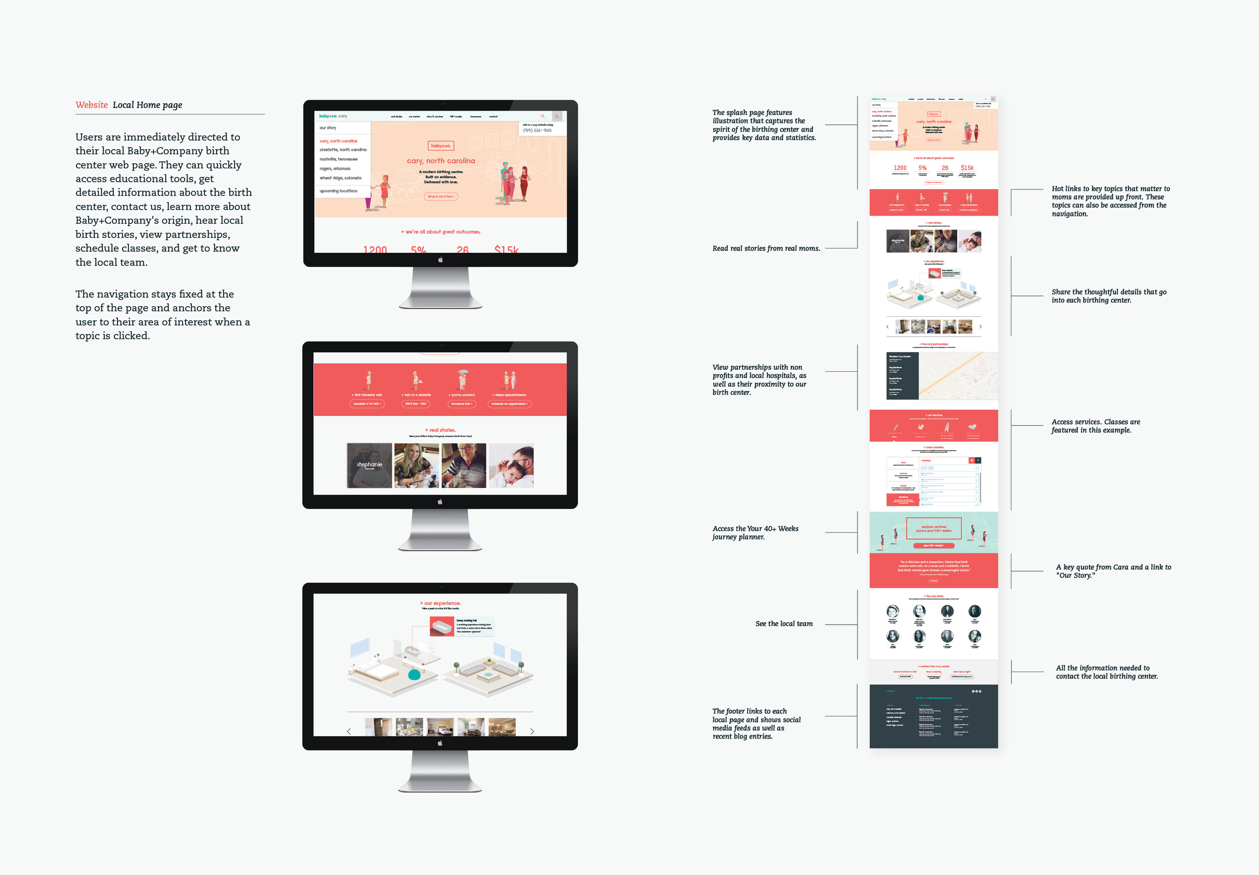
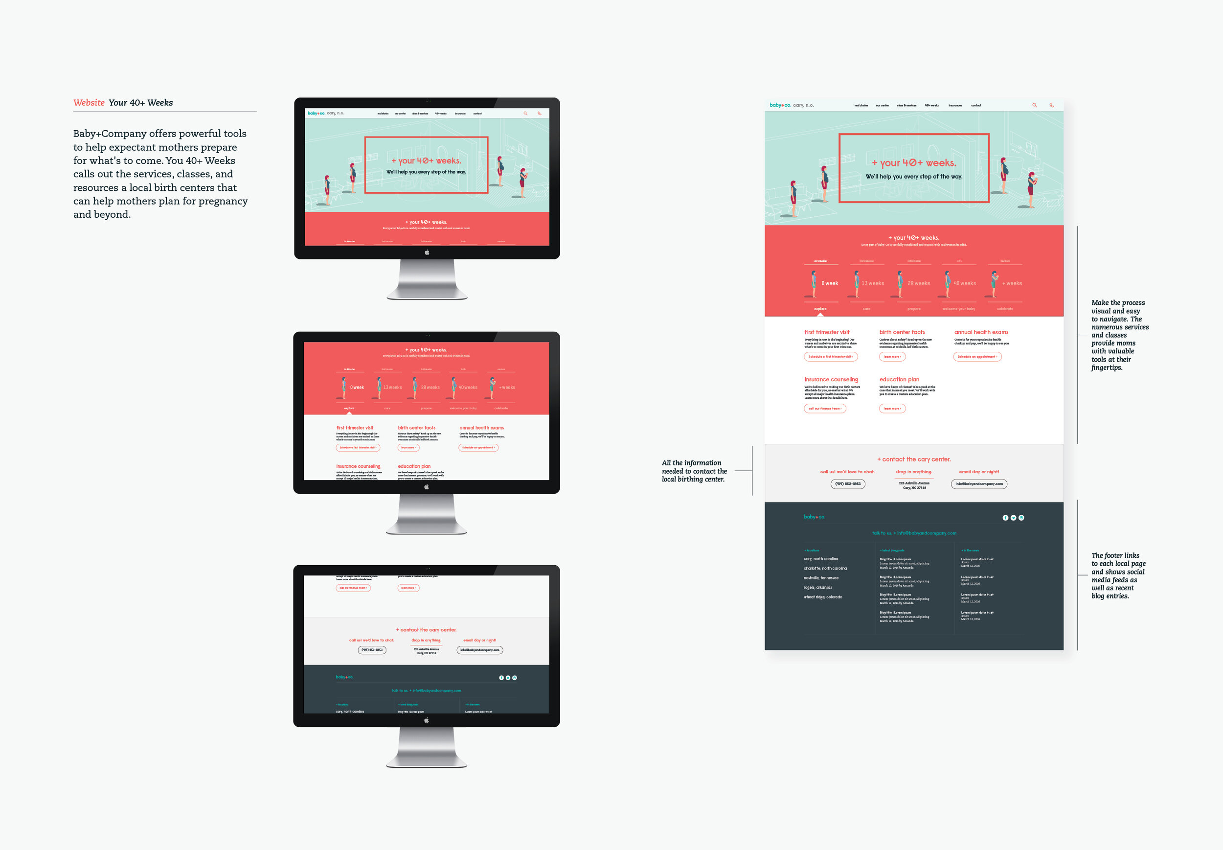
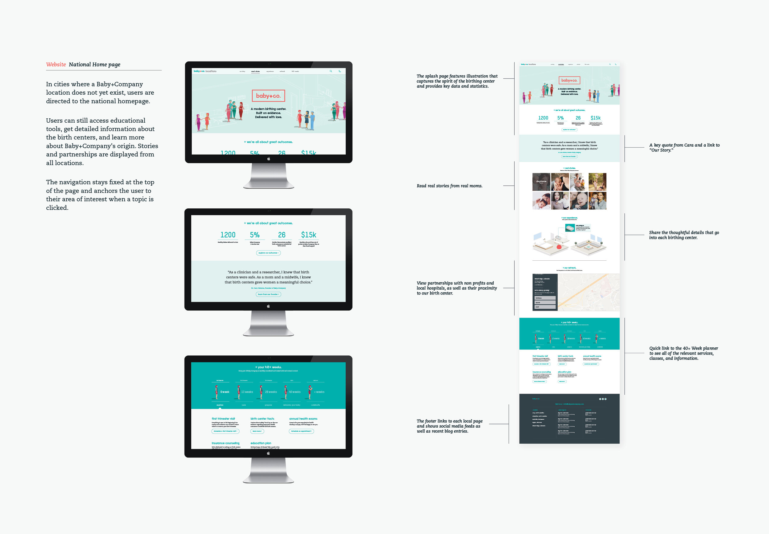
The web experience is the often the first point of contact with Baby+Co. The site was redesigned to be welcoming, informative, and easy to navigate. Key moments demonstrate brand expression, information architecture, and written tone.
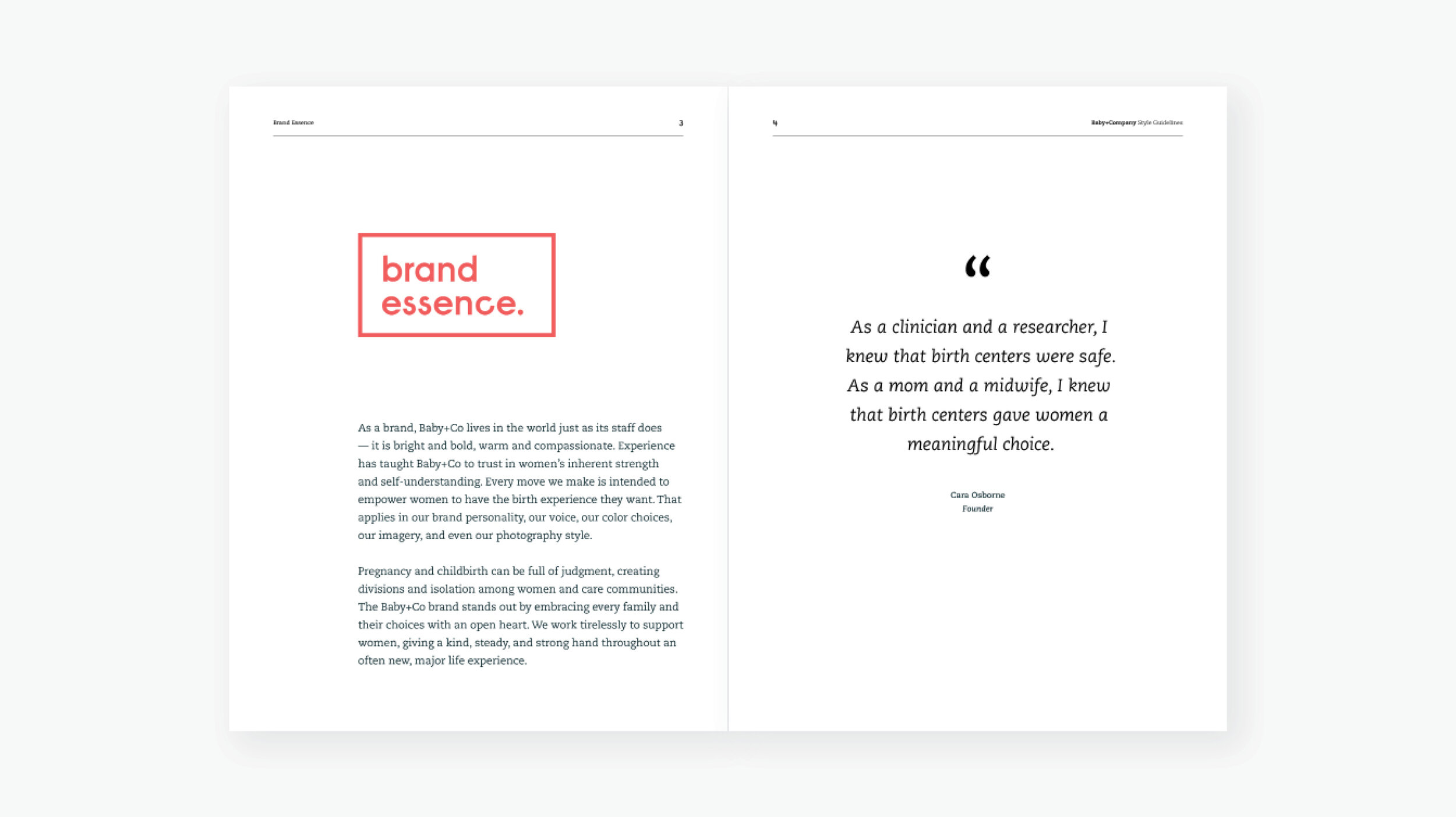
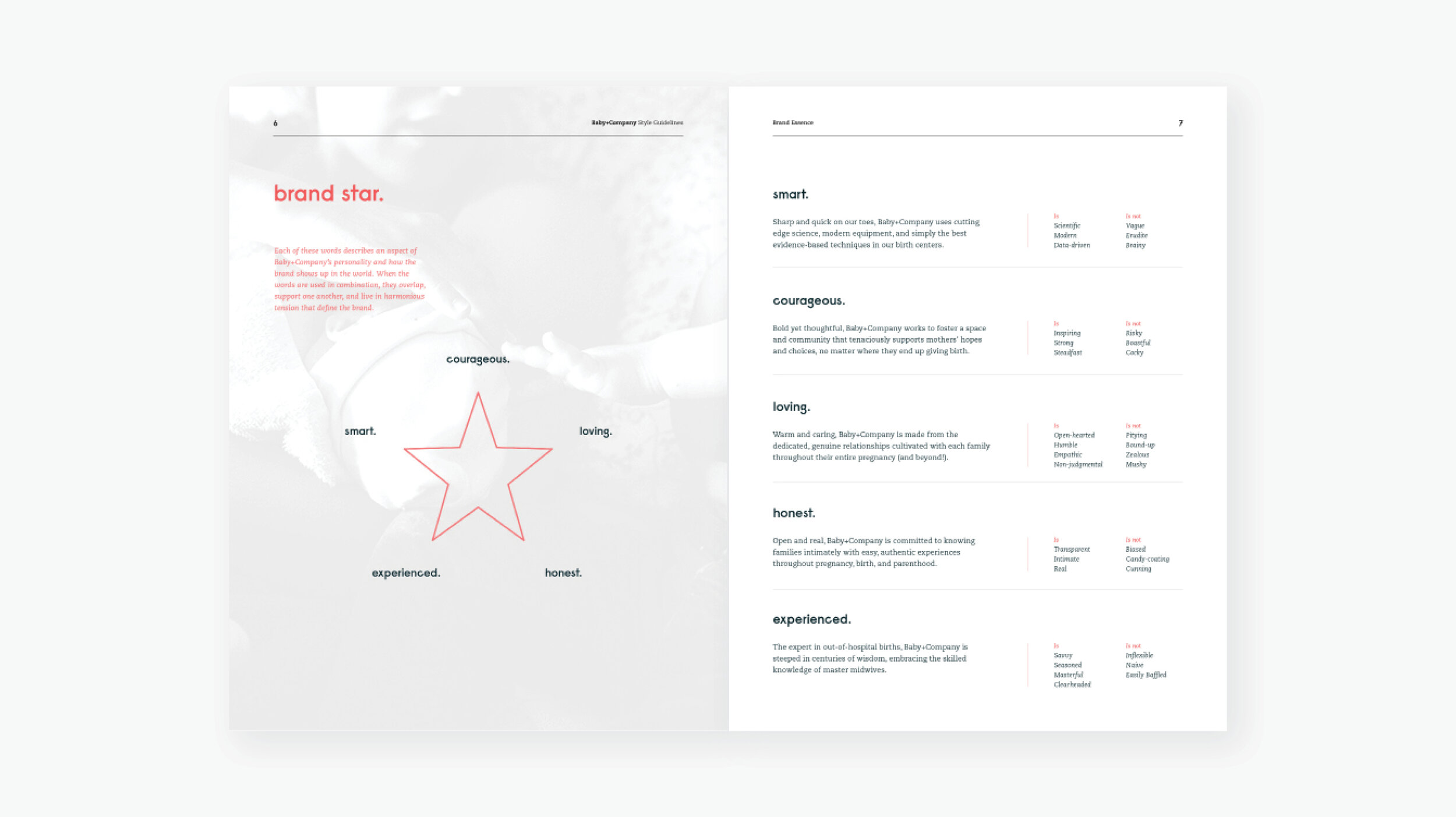
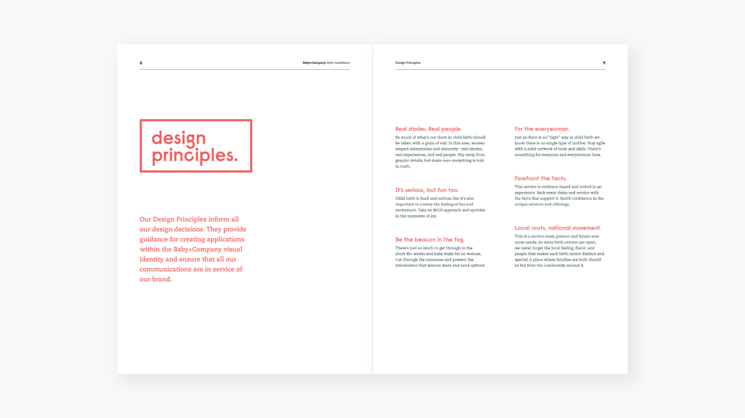
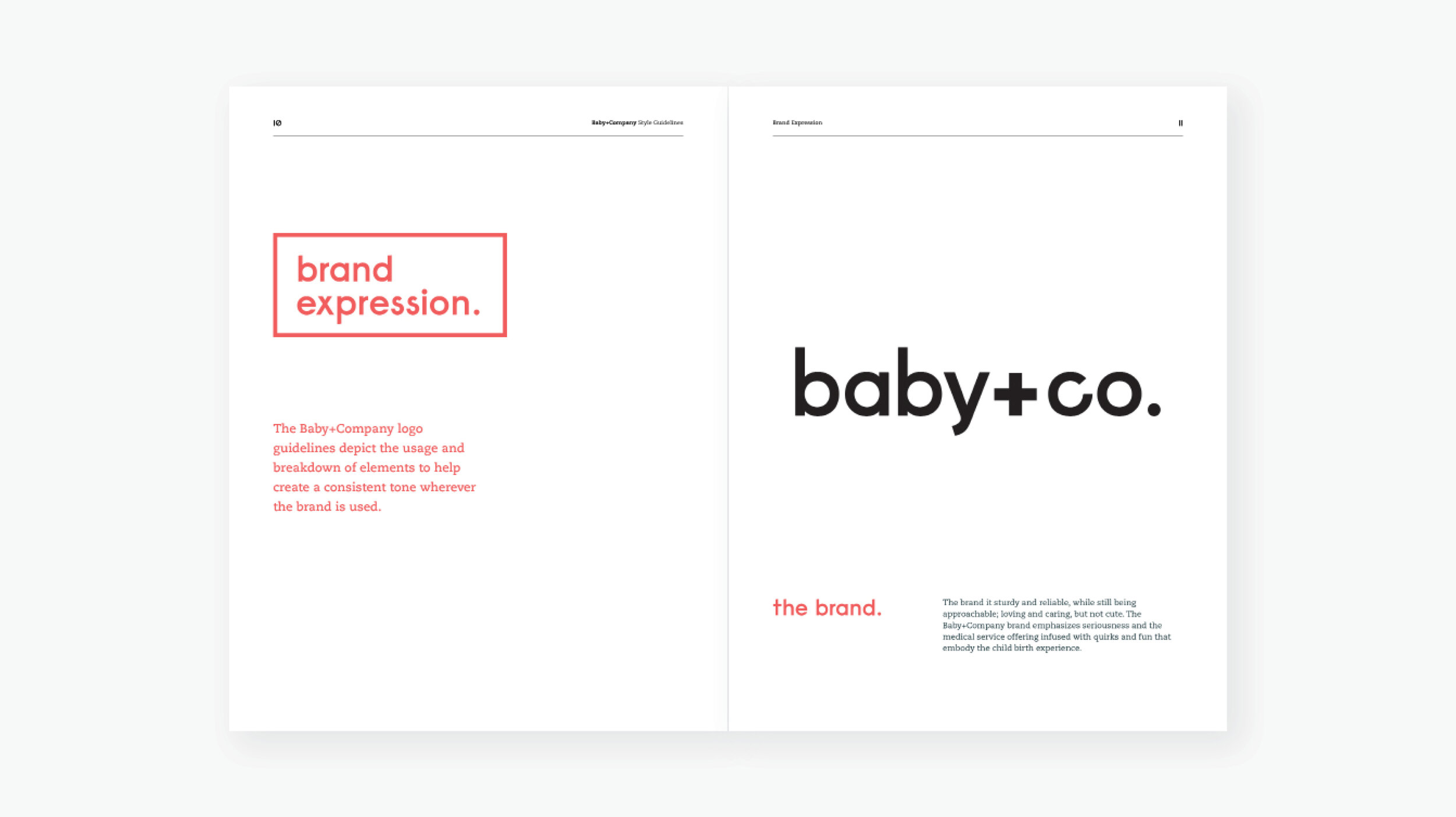
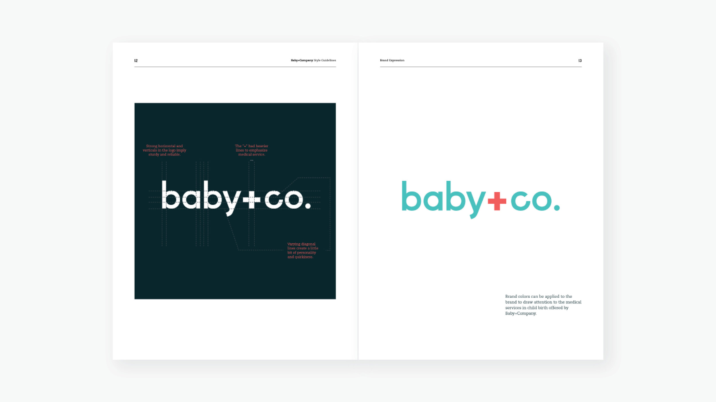
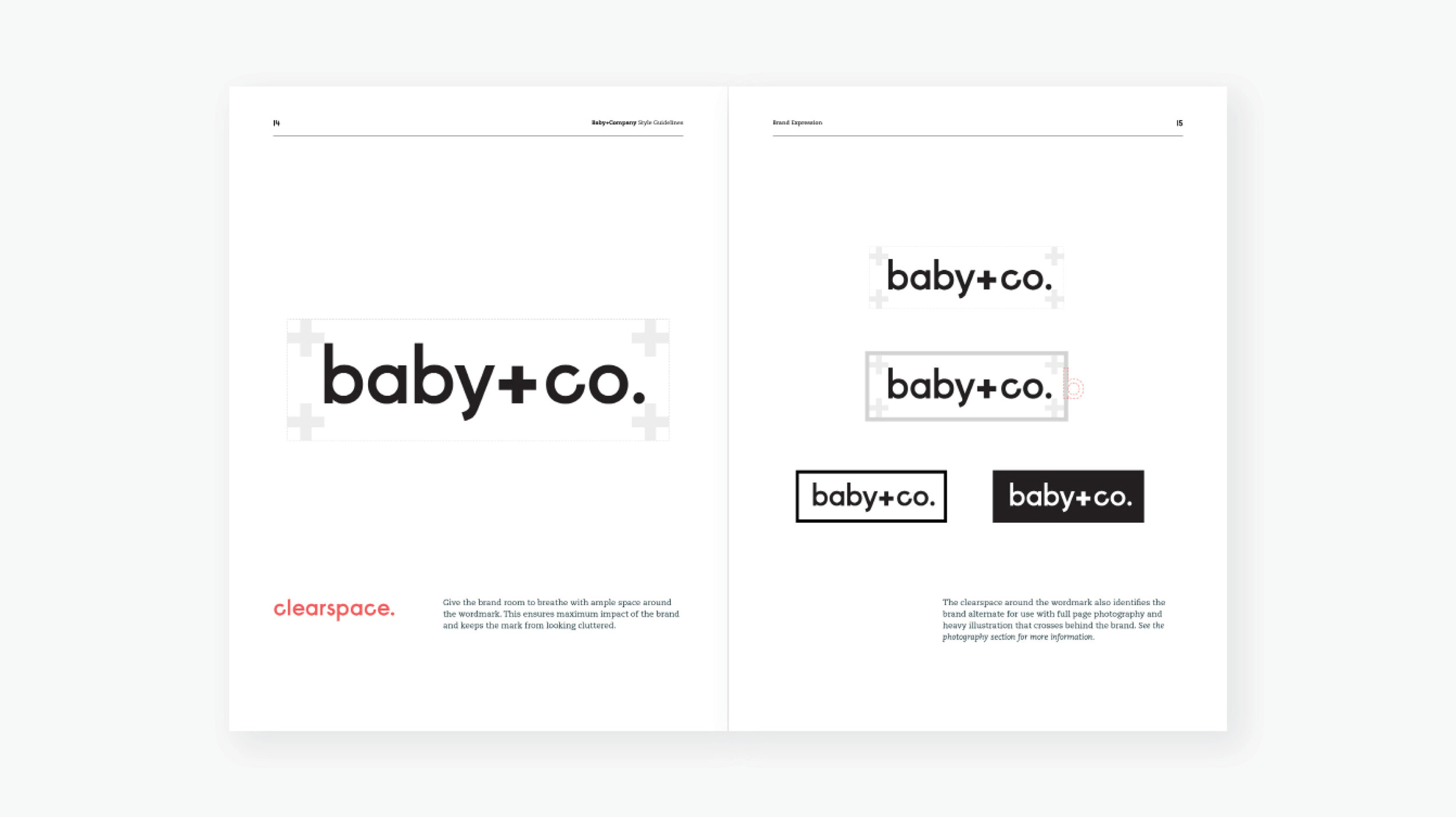
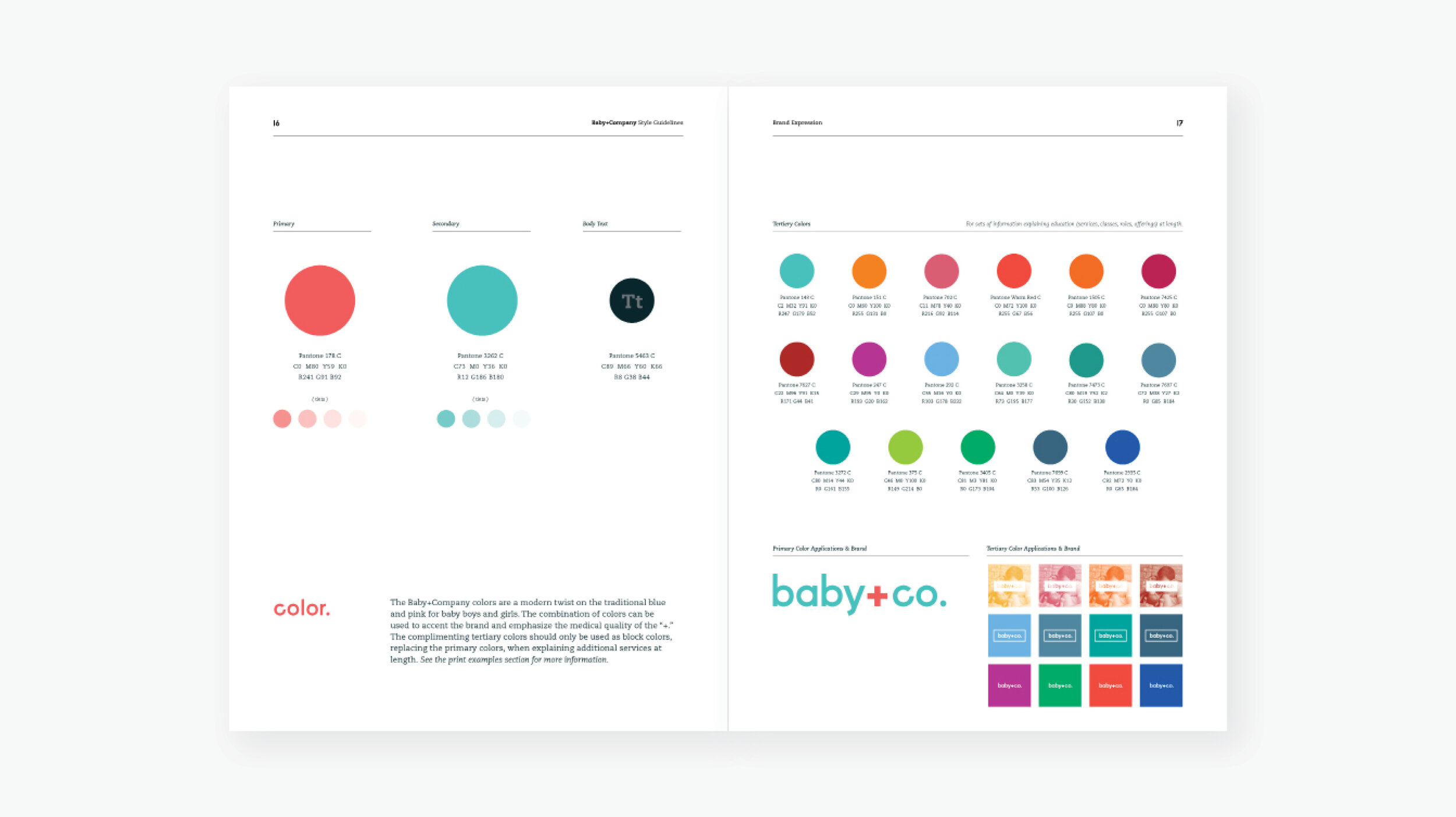
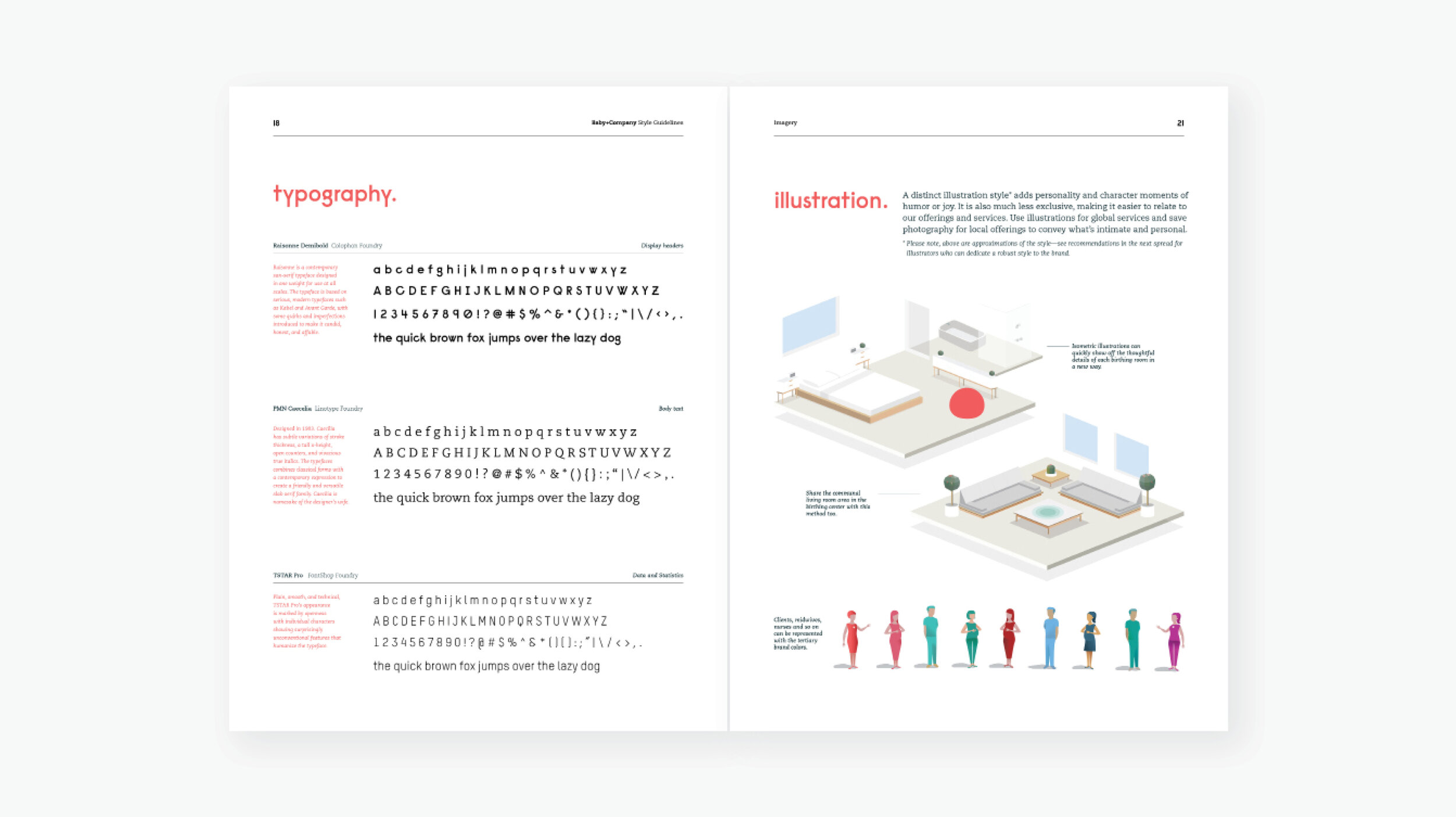
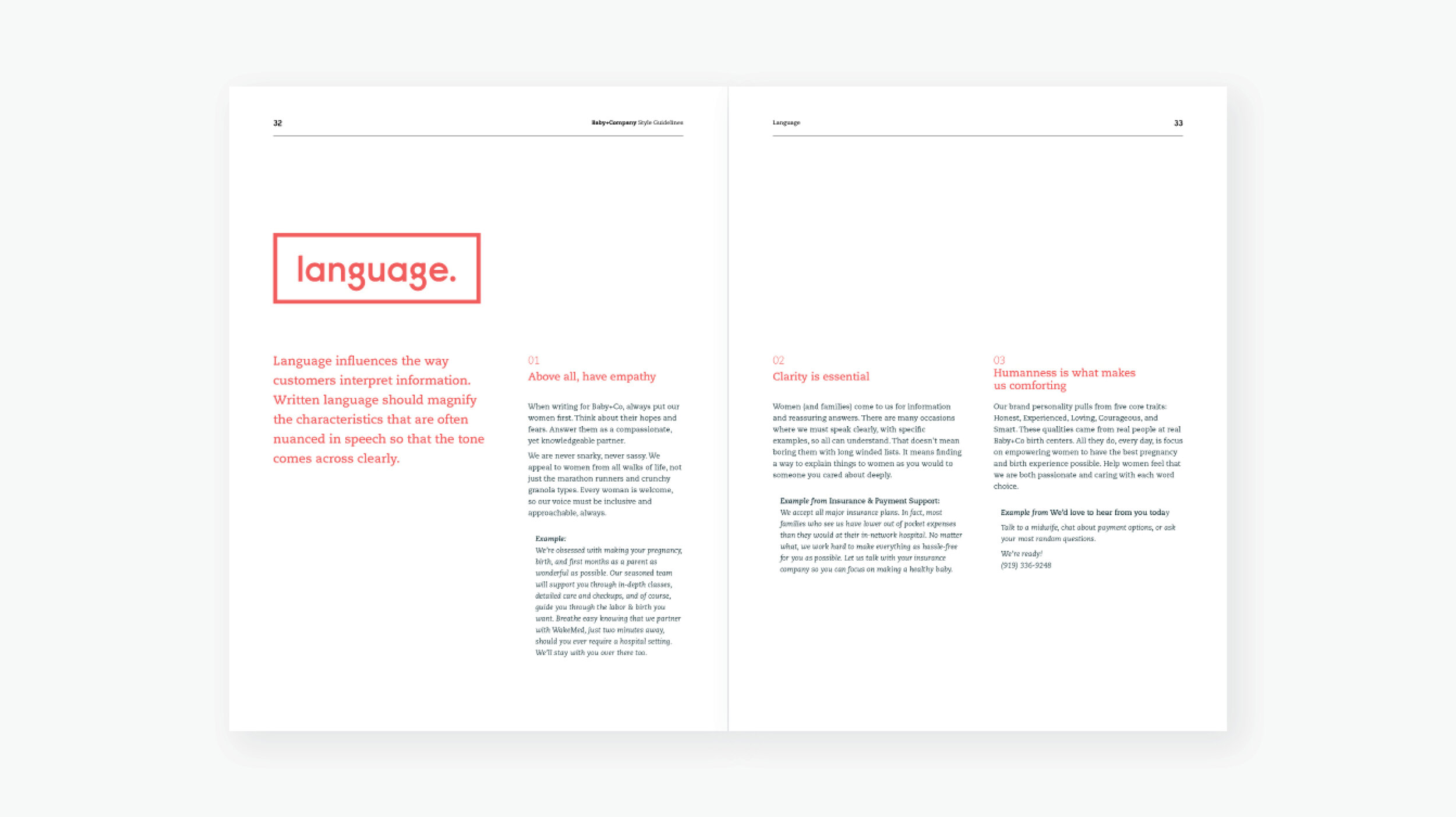
Friendly and informative pamphlets and booklets are available at birthing centers for new families to take home. Lightweight brand guidelines were provided as a digital document and printed booklet.